Lakes of Wada is an arts non-profit based in Ukiah, CA. The goal of the organization is to provide underrepresented artists with funding, technology services, residency programs, and more to aid them in the creation of new works. It was my responsibility to create an image for the organization that accurately reflected their goals of pushing artists to look beyond what they perceive to be possible and create exciting and innovative new artwork.
Visit Lakes of Wada HERE
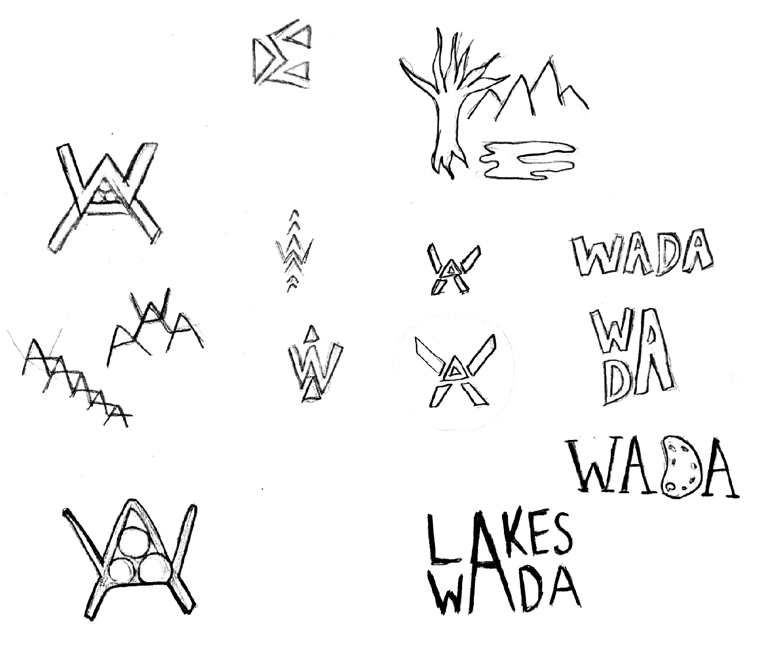
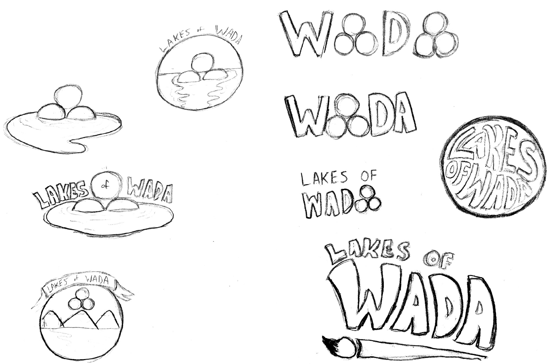
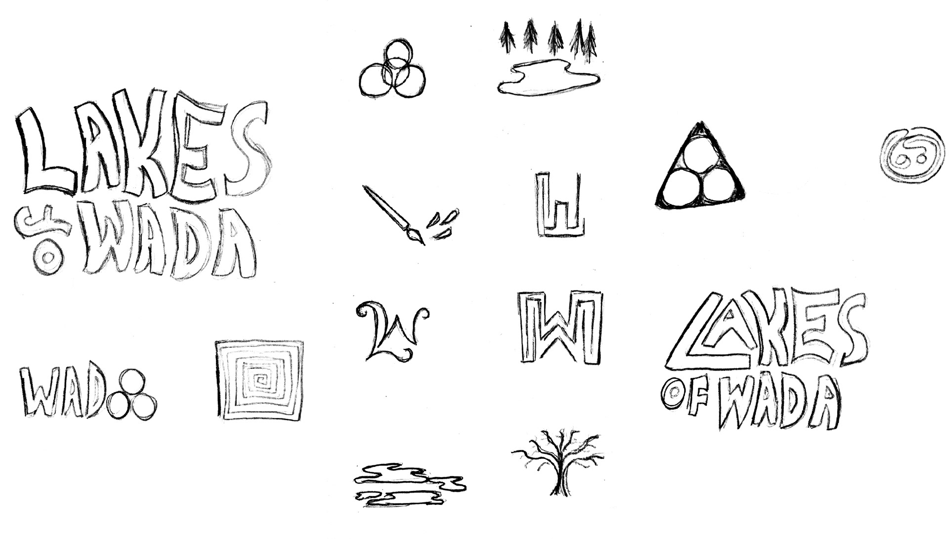
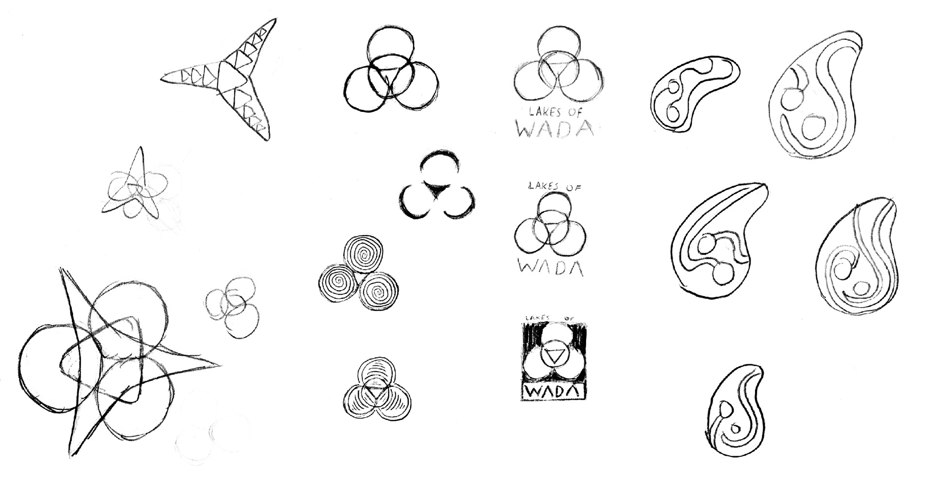
The name "Lakes of Wada" comes from a boundary math conundrum that can be visualized by four spheres reflecting off of one another, forming a fractal. The physical representation of this fractal is something I worked off of consistently when coming up with sketches for the logo.
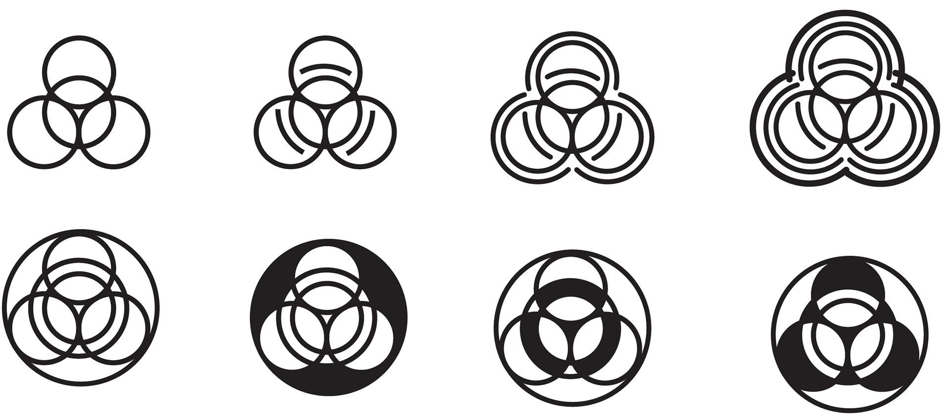
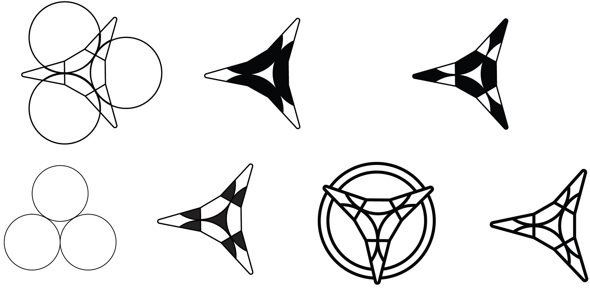
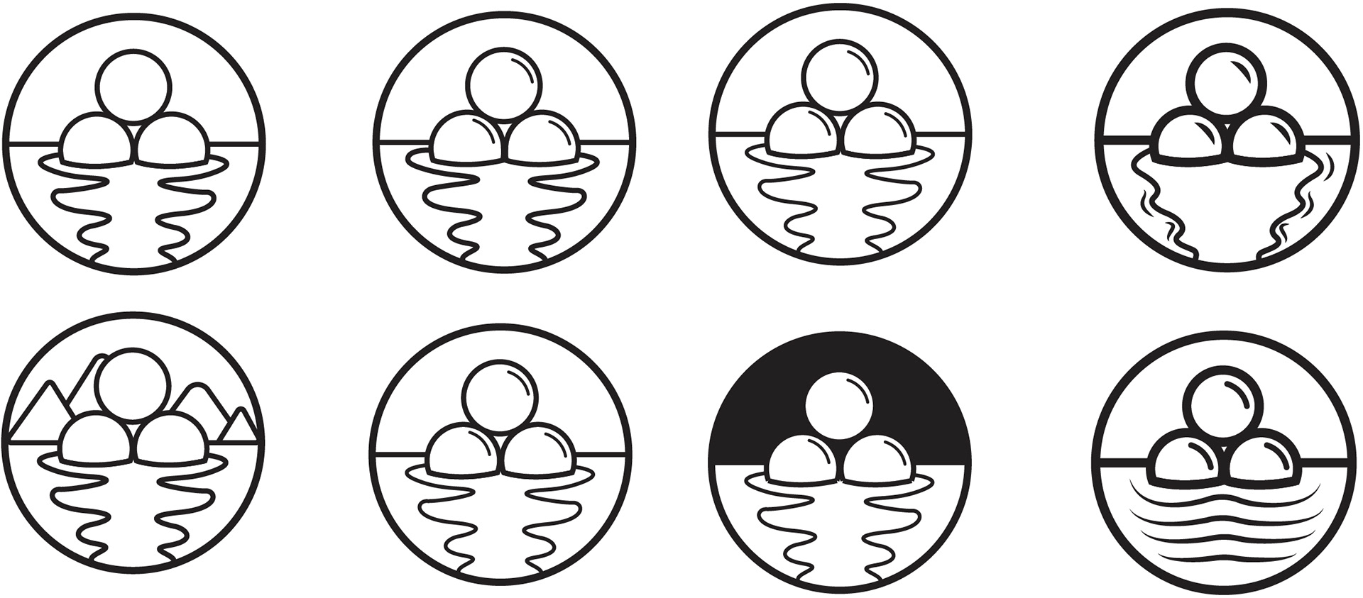
Once the ideas for the logo had been narrowed down, we looked at different styles and typeface pairings that would compliment the possible symbols and imagery that had been chosen.
The final logo options were compared with different color and typography options to determine the best possible combination for the organizations identity goals.
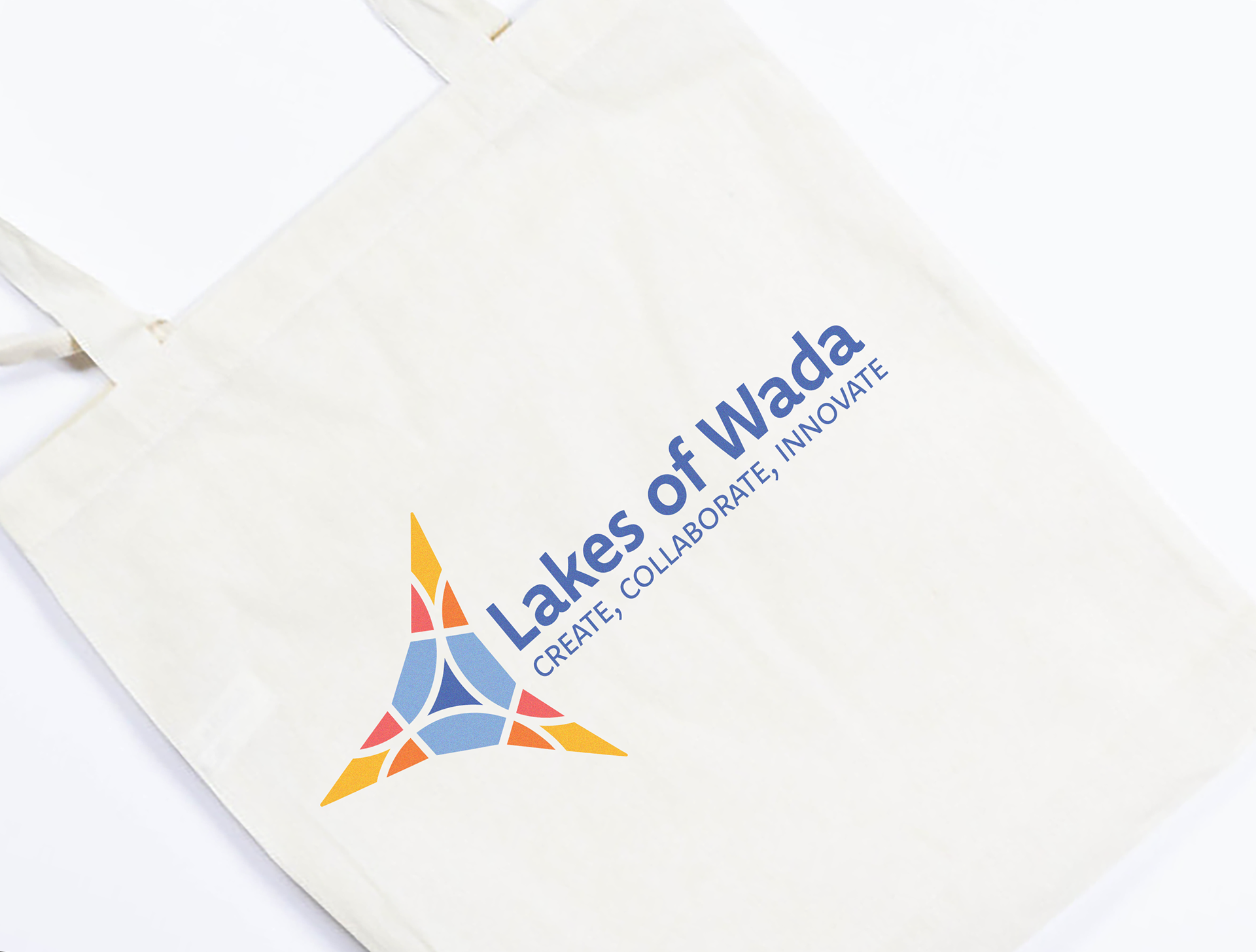
The color scheme that was chosen reflects the vibrant sunsets and oceans that exist throughout California, where Lakes of Wada is based.
The final logo is reflective of Lakes of Wada's mathematical namesake while also embodying an exciting and encouraging feeling of the desire to explore and create new things.
